
Vindicator 'Dresden' ready for battle
Posted by Unknown | Posted in Painting , Vindicator
Well, this took far longer than I thought it would. I have been gathering ideas for so long I figured it was time I put my paintbrush where my mouth is and do a tank.
As mentioned in an earlier blog post, I'm trying to incorporate Empire (from Warhammer Fantasy) into my Imperial Fists for various reasons. I started with a Vindicator because it's the closest thing to an Empire Steam Tank. 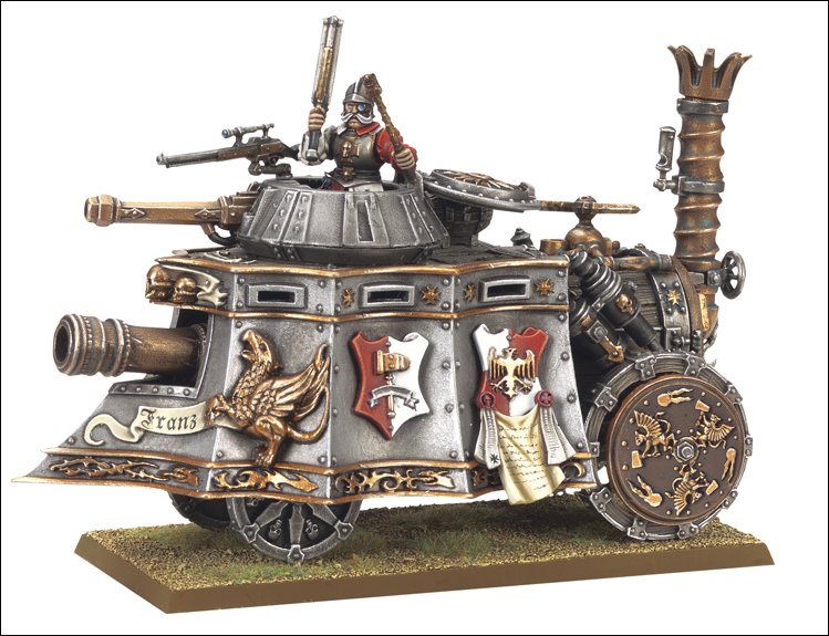
I used metal bits from the Games Workshop Imperial Fists icons pack. The rest was done with an airbrush and Reaper Master Series Paint. All of the text was done freehand with a Micron technical pen. Obviously that text is an homage to the intricate scrollwork at the bottom of an Empire Steam Tank and the add-ons bring to mind the shields. The font is my attempt at Fraktur (the German font) in freehand.


This took 3 evenings to complete. I will most likely add weathering to the tank at some point... but not yet. I want to enjoy it in the "pristine" condition for a while before I gunk it up.
The text is from Psalms 25:18 and can be found in an earlier blog post about using Latin for 40K.
Vide adflictionem meam et laborem meum; et porta omnia peccata mea.
Look upon mine affliction and my pain; and forgive all my sins.


That is pretty awesome looking I'd say. But there is something missing for me, the text at the bottom makes the tank a bit "bottom" heavy. Feels like there should be something at the top too. Oh, and some devlan mud on the tracks :)
Also consider drawing thin pencil lines as guides for the text to make it more straight, if that is indeed something you'd like.
This is really nifty, now I am thinking my tanks needs some text on them, at least the forthcoming Land Raider:)
Thanks for the feedback! I worked out a semi-system after the first side. You can certainly tell which one I did first. :) When I've recovered I'll see about what I can do to bring it back in balance. I have looked at this model far too long, I need to build other things for a while. LOL
It's a model worth looking at. Down right inspiring. And is there anything better than inspiring others with your work? That and giving your opponent a good Krumpin' like an Ork :)
I also like how the model isn't saturated in tons of red like often is the case with Imperial Fists. I know it's the color of the 3rd company but too much red stands out so much. Personally I went with fifth (black), fourth (green), and first (white), just to shake things up a bit:) For imagery see my blog (haven't been updated in a while because of inactivity, but I am gearing up again so it should blossom into life soon).